timeline
6 weeks (discovery + delivery)
team
Product Designer (solo), PO, Devs, UX Writer
platform
Mobile Web
constraints
Non-negotiable 6-week deadline. Organizational culture resistant to user testing. 100% rollout with no possibility of an A/B test. Integration with a legacy billing system.
confidential
NDA data flagged as [—]
Context
TIM's Payments area was under heavy pressure: customers with overdue bills received an SMS with a link to a web payment page, but complaint volumes kept growing. The page's CSAT was below the acceptable internal benchmark, and the most frequent complaint was simple and devastating: "PIX error".
The scenario had three hard constraints. A non-negotiable 6-week deadline for discovery and delivery. An organizational culture with very low adherence to usability testing with real users. And I was the only designer in the squad.
The Real Problem
The first hypothesis was technical: the PIX code was broken. The data said otherwise.
The interface didn't explain what the user was paying, didn't differentiate the PIX key types, and gave no instruction about what to do after copying the code. The customer copied it, opened their banking app, picked the wrong option — a phone key instead of Copy-and-Paste — and the payment failed.
Diagnosis: CSD Matrix
With the feedback corpus mapped, I structured a CSD Matrix to separate what we knew from the knowledge gaps before proposing any solution.
(Validated in the data)
- ▸67% of the problems are tied to the PIX flow
- ▸The current interface offers no process guidance at all
- ▸Customers do NOT understand the differences between PIX key types
(To be validated)
- ▸Users copy the code but pick the wrong option inside the banking app (e.g. phone key instead of copy-and-paste)
- ▸The lack of bill information raises suspicion of fraud
(Knowledge gaps)
- ▸How exactly do they try to use the copied code?
- ▸What was the real operational impact when the company moved from Barcode to this web page?
Critical insight:The problem was NOT technical (the PIX code worked on the backend). It was an EXPERIENCE problem — context and clear guidance were missing.
Adapting the Method
The original plan called for moderated usability tests with end users. The deadline and the organizational culture made that unfeasible.
The adaptation: in-depth interviews with internal specialists from the Payments and Customer Care areas — professionals who deal with customer frustration daily and accumulate tacit knowledge that no survey captures.
01 / 03
4 types
of distinct PIX keys. The lexical confusion between them — phone, CPF, e-mail, Copy-and-Paste — was the root cause the technical hypothesis had not mapped.
02 / 03
+34%
in support tickets after migrating from Barcode to the web page. The data came from internal specialists, not from a survey.
03 / 03
"Copy"
confused with QR Code or registering a phone PIX key — three completely different actions inside any banking app.
Decision Map
With the diagnosis consolidated, I ideated two proposals to debate with the squad and the areas involved.
The decision: we chose Proposal 2. The core argument wasn't aesthetic — it was about risk. Proposal 1 would solve the guidance problem, but keep the distrust of the page. Customers who don't know what they are paying simply don't pay, no matter how many instructions you add.
The explicit trade-off: we gained a definitive resolution of the 67% of problems and a significant increase in trust. We lost additional sprints on a deadline that was already tight.
The Conflict
Proposal 2 created an unexpected problem between areas.
The Payments area wanted to make paying on the web as easy as possible — its main goal was reducing delinquency immediately. The Customer Care area wanted the opposite path: pushing users to the Meu TIM app to increase logged-in access, which was its leadership's target.
The data team raised a concrete number: Proposal 2, being very complete, could reduce clicks on the app CTA by approximately 15% — directly impacting the Customer Care area's target.
With genuinely conflicting goals and data backing both sides, the way out wasn't technical. It was political.
Process: Light Decision Jam
I facilitated a 90-minute remote workshop in FigJam with representatives from Payments, Customer Care and Data. The format followed four steps: surfacing problems with the current solution, prioritizing by Impact × Urgency, identifying strengths of the context, and proposing joint hybrid solutions.
The breakthrough happened when the group reached the same conclusion together: guaranteeing the page's trustworthiness was more urgent than generating clicks on an app CTA that weren't converting into payments anyway.
The hybrid solution:
- We prioritized PIX clarity on the web (full Proposal 2)
- We recommended the Meu TIM app only for those who needed the detailed bill PDF — a legitimate use case that preserved Customer Care's target without sacrificing the payment experience
100% alignment between the three areas. No tie-breaking vote. No hierarchy.
The Solution
The redesigned page attacked the three root causes identified in the diagnosis:
before

No bill context or guidance
after

Bill front and center, PIX without ambiguity
Lack of context → Bill details front and center. Customer, TIM number, amount and due date visible before any action. Users know exactly what they are paying.
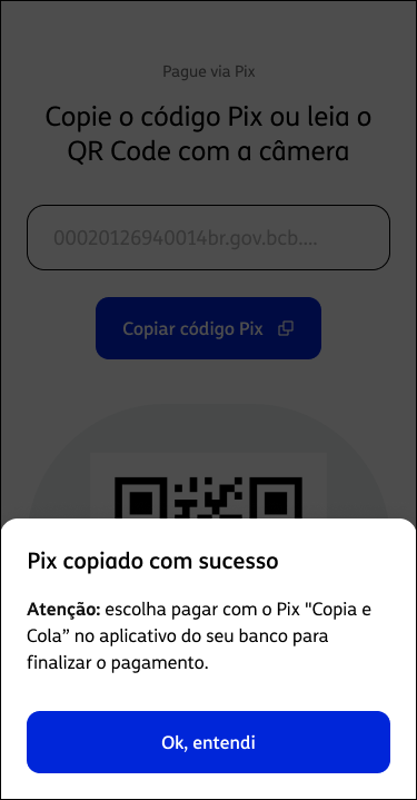
Absence of guidance → Isolated PIX code and feedback modal. An unambiguous "Copy PIX code" button. After copying, an immediate modal: "PIX copied successfully — choose to pay with PIX Copy-and-Paste in your bank's app."
Low trust → FAQ grounded in real data. The 217 complaints became the basis of the "How to pay" FAQ — each question answering a real doubt documented in the corpus.
Customer Care's target → Contextual CTA to the Meu TIM app. Present for those who need the detailed PDF, without competing with the main payment flow.
Alternative options (bank slip) → Visible without scrolling.
Who Did What
What Got Worse
Average completion time increased by 8 seconds (from 42s to 50s). The cause is direct: more content means more reading time. It wasn't a design error — it was an accepted consequence of the decision to prioritize guidance over speed. But it's a number that deserves monitoring.
Customers still call the call center saying "I copied it, but couldn't find where to paste it." The gap between the web environment and each bank's app persists — and it's outside our span of control with the current solution.
Two methodological limitations that reduce the precision of the results:
- No A/B test: the 100% rollout was a business decision. The causality between the redesign and the results isn't perfect — macro variables weren't isolated.
- CSAT bias: the survey was only shown after a completed payment, which creates an intrinsic positive bias. The numbers are directional, not absolute.
Retrospective
lesson 01
I would test Proposal 1 first
A 2-week quick win would have validated the real impact of the copy before spending resources on the bill API integration. Cheap validation comes before a complete solution.
lesson 02
I would fight harder for the A/B test
Even with cultural resistance, I would argue more forcefully about the risk of not having proven causality. Impact data without variable isolation is vulnerable in any results review.
lesson 03
I would test progressive disclosure
I assumed more context about the debt would always be better. I should have tested collapsed details in an accordion before exposing everything at once — especially given the increase in completion time.
The most honest lesson: I realized I have a tendency as a designer to prioritize the complete systemic solution over imperfect quick wins. In this project, that tendency produced a better outcome — but at a schedule cost that could have been avoided with more discipline around incremental validation.
Results
Measured 3 months after launch:
+26pp
CSAT
in 3 months, beating the internal benchmark of 60%
7 digits
savings
recovered delinquency, calculated by the finance team
100%
alignment
Payments, Support and Data — no escalation to leadership
- CSAT: rose more than 26 percentage points, comfortably beating the internal benchmark of 60%
- Savings: seven-figure recovered delinquency, calculated by the finance team comparing the month before launch
- Alignment: 100% consensus between Payments, Customer Care and Data — no escalation to leadership
Methodology: CSAT measured via an evaluation modal shown after a completed payment. Savings calculated by the finance team; the figure is directional, not an accounting audit.