timeline
[—]
team
1 Product Designer (solo in the squad), 1 UX Writer, 4 product designers (co-creation), 4 POs
platform
Web and Mobile Web
constraints
4 non-negotiable and divergent business rules across products. Keeping UX consistency without stifling each squad's autonomy.
confidential
No
Context
On the TIM Portal, pricing is the module where conversion happens. It's where customers compare plans and decide what to buy. The problem is that this module wasn't a single one. Four product squads recreated and applied their own version, each with a different layout and structure.
The effect was cumulative. Users struggled to compare offers across products, especially in natural transitions like migrating from Pré to Controle. Global conversion stayed below expectations out of sheer cognitive overload. And the UX and engineering teams reinvented the wheel on every page, generating constant rework.
Add to that a detail that set the tone of the project: the environment had low design and testing maturity. Validating with users wasn't routine — it was something to be built from scratch alongside the solution.
The Challenge
Each product had its own non-negotiable business rule. Imposing a single layout top-down wasn't an option, because each squad was solving a real, different need.
TIM Controle
non-negotiable rule · Multiple plans
Several similar plans create complexity. Users need to tell near-identical offers apart without getting lost.
TIM Pós (Black)
non-negotiable rule · Value focus
The sale revolves around added benefits (VAS) such as Disney+ and Amazon Prime. Perceived value is the argument, not data volume.
TIM Pré
non-negotiable rule · Simplicity
Direct top-up, quick decision. Any excess information works against conversion.
TIM Fibra
non-negotiable rule · Combos
Internet bundled with services. The card must communicate the package, not an isolated item.
Goal:a single module that meets all four business rules without overloading the user with excess information.
The challenge wasn't picking one rule as the right one. It was finding a structure that respected all four at the same time.
Discovery in the Data
The first step was looking at what the analytics tools already said about how the different applications of the module impacted results. Four patterns kept repeating.
// what the data says · GA + Hotjar
The CTA in the first position of the card gets more clicks than in later positions or in the footer.
ImplicationThe button's visual hierarchy is critical and non-negotiable.
Users pick the offer shown in the first position far more often (left on desktop, first in the mobile carousel).
ImplicationPresentation order is a strategic business tool.
Cards with the "Best offer" tag consistently get more clicks than cards without any directional marker.
ImplicationThe highlight system needs to be strongly standardized.
Average rejection in plan-selection flows is 42%, with wide variation across products.
ImplicationSome interfaces already perform better: there is immediate room for cross-product optimization.
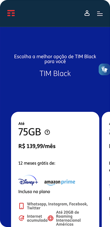
Browsing the product pages on mobile, I found the most serious issue. The card's sizing pushed the CTA below the first fold, compounded by information overload and little perceived difference between neighboring offers.
Hypothesis
With the learnings synthesized, I formulated a hypothesis together with the PO to guide the solution.
Rework the module's information structure, ensuring it serves the different business rules and makes it easier for users to understand the offers. With that, we expect to reduce the rejection rate and increase interaction with the module.
Co-creation Process
Before designing, I analyzed competitors and references from other markets to understand how to simplify the card without losing relevant information.
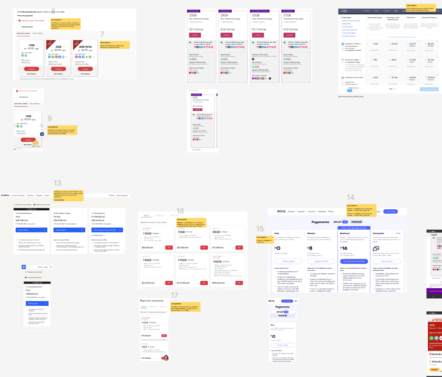
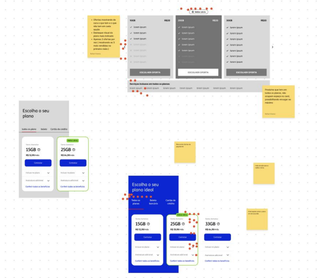
Since the module had to serve all four squads, deciding alone made no sense. I facilitated a co-creation session with each squad's UX team, so the solutions would be born already accounting for everyone's demands.
First Iteration
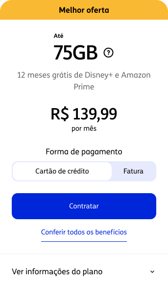
Refining the most-voted suggestions from the session, I assembled the first version of the card. It already featured the highlight for the most advantageous offer, more weight for data and price, the payment-method choice inside the card, supporting text to differentiate the offers, and benefits simplified into a collapse.
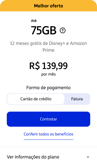
To capture the business view, I took this version to a critique with the POs of the four squads. The main concern was about the benefits that would be hidden in the collapse — precisely what each squad considered its strategic differentiator.
Usability Test
Here is one of the points I'm most proud of in this project. In an environment with low testing maturity, structuring a formal evaluation was, in itself, a demonstration of the value of testing: catching and anticipating problems before anything goes to production.
I ran a moderated remote test with 5 users to evaluate the new module's efficiency. I also used it to validate which factors they consider when purchasing an offer. Data and price were the most cited, confirming the hierarchy I had been reinforcing.
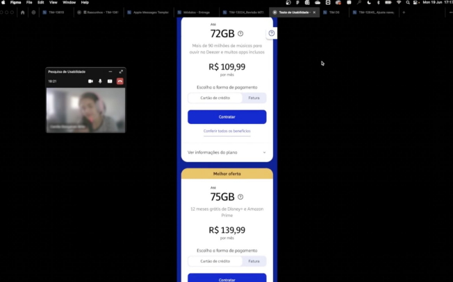
At the end, participants answered the SUS questionnaire to measure perceived ease of use.
The high score didn't blind me to the problems. During the sessions, two critical issues surfaced on the card, highlighted below.
Post-test Iteration
I restructured the visual hierarchy into two blocks. The first highlights the offer's main differentiator, now with service logos instead of plain text. The second gathers the complementary benefits. In place of the payment choice came the option to add an extra service, with a more explicit toggle.
before

Benefit as text, dense reading
after
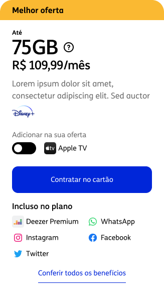
Two blocks, logos and a clear extra service
The Solution
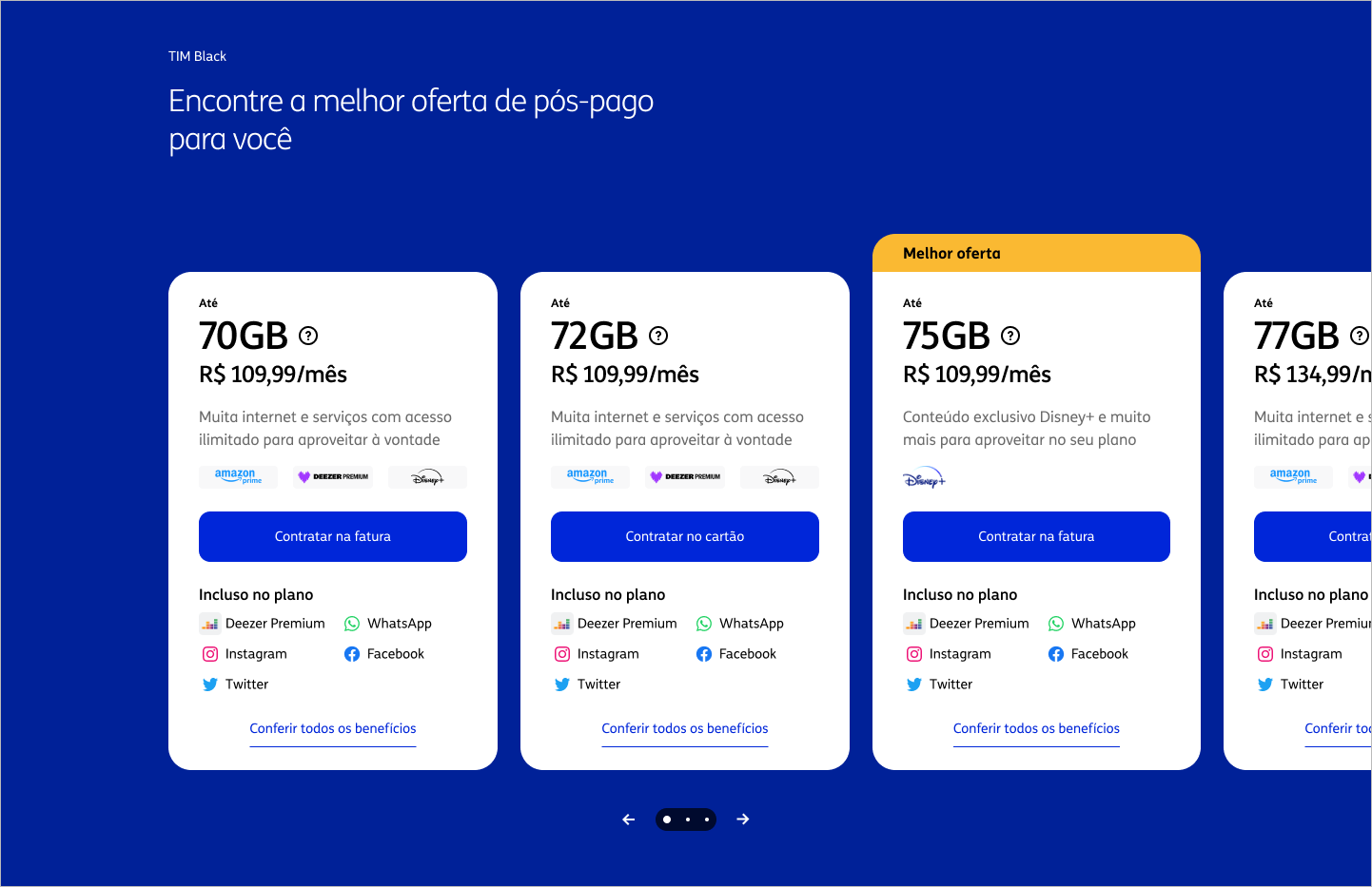
The answer to the four rules wasn't a single, closed card. It was a modular system. The validated best practices stay fixed and guarantee consistency; the content that changes from product to product stays configurable.
// a system, not a template
Fixed
non-negotiable best practices
- ▸Visual highlight of the best offer
- ▸Hierarchy of data (GB) and price
- ▸CTA in the first position of the card
Configurable
per squad, according to business rules
- ▸Payment method on the card
- ▸Optional extra service (toggle)
- ▸Benefits and VAS displayed
- ▸Combos and supporting content
the combinations of the configurable block produce six card formats without breaking consistency
With that, each squad assembles its own variation without breaking comparability across products or reopening decisions already validated. The modules switch on and off according to each product's rules, from the full card to the leanest one.
// variations of the same system
01 / 06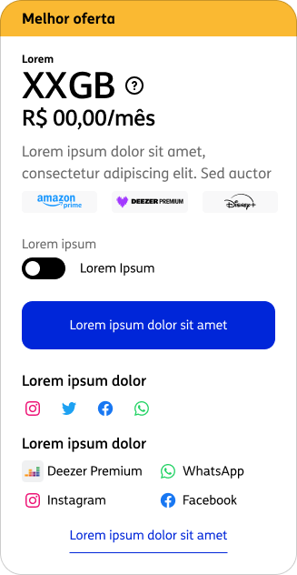

Who Did What
The role was cross-cutting, connecting four squads that used to work in isolation.
Results
To validate the improvements, the TIM Controle squad was the first to implement the new pricing.
87
SUS
Excellent range in the test with 5 users
4
squads aligned
Controle, Pós, Pré and Fibra around a single module
100%
cross-product adoption
the modular system became the standard across all four squads
The leaner formatting raised the average view rate along the page, and the vertical navigation on mobile made exploring the offers easier, with an increase in click-through rate to purchase. More than the numbers, the project left behind a system all four squads adopted and a precedent: that it pays to test before shipping to production.
Methodology: view and click gains measured in the TIM Controle implementation, the first squad to adopt the module. These are directional indicators, not yet consolidated cross-product.